My vote has been negated
If you read my earlier post concerning the recent change of typeface/font by the Dayton Daily News, you would know that I was not happy at all about it. As a person who possesses a 'critical eye', such a change to a product that I've become very familiar with over the past dozen years or so was a shock to my system--so much so that I drafted my response to it here on the blog and sent Jana Collier an email with a link to my critique. I didn't get a formal reply to my submission but I found this item related to the change tucked in the bottom corner of page A2 of last Tuesday's DDN.
I had hoped that my section-by-section analysis would somehow bring this unique perspective into the discussion and, perhaps, have Ms. Collier rethink her decision to make such a wholesale 'facelift' of Dayton's only daily newspaper. It appears that Ms. Zurawka's opinion is one that she found favorable to this change and used that correspondence to defend Cox Media Group's unilateral verdict on the need for revamping the outward appearance of their papers under the guise of 'readability'.
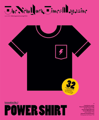
I would probably have forgotten about that blurb if it wasn't for today's edition of The New York Times Magazine, part of the Sunday edition of that newspaper. I normally fish it out of the plastic sleeve first so I can give it to my wife to allow her unfettered access to the various puzzles after I read it. When I looked at the front cover, this is what I saw:
Today's offering of the weekly magazine was dubbed "the innovation issue" which featured 32 new ways that will change the way we do things in the future. I never did read the story about the "power shirt" featured on the front because my eyes were immediately affixed to the logo at the top. Here is what I usually see every week:
Ahhhhh...the traditional Gothic typeface that announces to the reader that THIS is a world-class newspaper. A symbol of stability in a very unstable industry. An example of tradition that hasn't changed in over 45 years (in 1967, they took the period after Times away after 116 years with it sitting there and an almost 10-year contentious debate about making such a minor change).
Apparently, to coincide with this week's innovation theme, the paper asked eight designers to re-imagine the magazine's logo (a slideshow of all the submissions can be found at this link). Here's a closer look at today's logo, created by the design firm Non-Format:
According to the paper's web site, here is what those particular artists were trying to do:
We were looking to put legibility to the test. By abstracting the gothic script of The New York Times Magazine’s logotype, we reduced it to a seemingly arbitrary collection of geometric shapes. When viewed individually, each letter may be difficult to recognize, but we hope that when gathered together, the letters create a logotype no less familiar than the original. As the brilliant type designer Zuzana Licko once said, “You read best what you read most.”While I can, to a certain degree, see what they were attempting to do, my toes were tightly clenched in abject aversion to this violation of what I consider to be one of the most sacrosanct symbols in all of journalism. There are even odder and more abstract ones in that slideshow that either incorporate the existing logo in non-traditional ways or ignore it completely.
While never a business or marketing student, I am well aware of the importance of a logo to convey a subtle (or perhaps a blatant) message to your customers, subscribers, readers or viewers. I went through several iterations of journalism-related images before I found one that I felt imparted what I felt was "me" and it adorns the top of this blog. Although this site's templates are somewhat limiting on creativity, I was able to blend imagery and a typeface into a graphic that reflects my unique professional and chronological background. While it can be improved upon, I don't think I would throw it out wholesale based solely upon the whims of my readership.
Just ask Bill Ford how important a company's corporate symbol is
If you don't think that branding or logos aren't important, just ask the Ford Motor Company. Back in 2006, the automaker used their famous blue oval and the rest of their corporate assets as part of an overall collateral package to secure more than $23 billion in loans to avoid bankruptcy. That treasured symbol was returned to the company just last month when two of the three major credit reporting agencies upgraded their stock to "investment grade". The Ford family took this news very personally:
"When we pledged the Ford blue oval as part of the loan package, we were not just pledging an asset. We pledged our heritage," Ford Chairman Bill Ford said in a statement. "Getting the Ford blue oval back feels amazing, and it is one of the best days that I can remember."
I can only pray that today was a one-time creative exercise by Hugo Lindgren and his staff and that any materials from it will be sealed inside a wooden crate and stored at an undisclosed government warehouse in perpetuity. And I also hope that Ms. Collier and the CMG people never find where that box is hidden away so that at least ONE part of the Dayton Daily News might stay the same for the foreseeable future.


No comments:
Post a Comment