

Is ANYTHING off limits, Ms. Collier?
Over the past few months, I've been getting emails and seeing updates from Jana Collier, editor of the Dayton Daily News, about improvements to the paper and updates about stories the news room is currently covering. This is part of a self-promotion initiative started last November when the paper announced an increase in readership--the first such rise in the past decade. The latest update I was notified about concerned changes to the DDN's "Life" section (expanded coverage and a weekly schedule for specific items--i.e. Life & Arts on Sundays, Life & Health on Tuesdays, Life & Food on Wednesdays). All-in-all, none of these seemed to be very drastic and were merely attempts by the paper at organizing content and rebranding their local investigative and news coverage which, in the big scheme of things, did not detract from the aesthetics surrounding reading the Dayton region's "paper of record". Unfortunately, that would all change this past Sunday.
When I went outside to grab our papers (we also get the New York Times' Sunday edition), I wasn't quite awake enough to detect the drastic changes that were barely visible though its blue translucent protective sleeve. After breakfast and my weekly chat session with a close friend of mine through Fox News Sunday and the last half hour of CBS Sunday Morning, I removed the bundle from its sleeve and began staring at something I did not recognize. The nameplate looked familiar but everything else looked different. I scanned the entire front page and that's when I found the note I posted above from Ms. Collier about the paper's most recent change--its appearance!
In her three-paragraph announcement, she stated that the DDN decided to change its fonts and typefaces due to reader input (no one asked for MY opinion) and to make the paper more "readable". Collier said that these changes were for legibility and clarity purposes and that "they have been tested and proven successful at other newspapers." She closed by saying that the paper will continue to find ways to improve and solicited suggestions and comments from the readers. Since I'm not a fan of email submissions (they're just a one-to-one medium that can be deleted if the recipient chooses to ignore it), I am presenting my opinion in a forum that cannot be 'disappeared' by a single keystroke.
Our household has been a loyal subscriber to the Dayton Daily News since we moved to this area back in the late 1990s. Over the past dozen years or so, it has provided us with our daily fix of news, sports, comics and other features that we couldn't get from any other reliable source (it is the only major paper in town and we started reading it when internet news was in its 'toddlerhood'). During that period, the newspaper industry changed and the DDN, like most all other dailies throughout the country, had to adapt in order to survive and, at best, break even. Smaller publications (in both sections and physical dimensions), highlighting 'fluff' (entertainment, lifestyles, etc.) over 'substance' (hard news, especially concerning information from overseas areas), and the 'balancing' of editorial pages are just a few of the concessions local and regional newspapers had to make to retain some level of relevancy in today's virtual smorgasbord of information options.
In Collier's defense, there were no noticeable differences in the CONTENT of the Sunday paper. It contained its five basic sections (main news, local, sports, life and business) and, based upon the subjects covered, seemed to be sticking to its usual 'beat' of stories it does every Sunday (and the rest of the week). However, a key component of a paper's overall presentation to its subscribers and purchasers is its APPEARANCE and it is that ingredient to their overall product where, in my opinion, the DDN has "caved" to popular opinion in this case.
Below are photos of this Sunday's paper as well as from last Friday to provide comparison and contrast of these "subtle changes":

- the 'A' section (news, business Monday through Saturday, opinion): similar layouts (nameplate anchors the page, 'teasers' and quick weather outlook above it and two edge areas surrounding the centered main story below) but a very different look. While both have bold banner headlines, the new format uses ALL CAPS BOLDED lettering would best be reserved for truly historic events (9/11 attacks, Pearl Harbor, etc.) instead of one that will probably come up several more times throughout the current election cycle. The mixing of serif and sans serif fonts continues in this new format but it seems more obvious--and distracting--in the updated version.

- the 'B' section (local/community news, obituaries): more similarities but some obvious changes. The section heading has been changed and is now one long solid blue bar instead of the dark/light blue one seen in the previous version. This poses problems with 'teasers' and limits them to just one to the right of the bar. Both feature sans serif bolded banner headlines that shun ALL CAPS BOLDED lettering; however, the newer one uses serif for the subordinate stories while the older kept the same--but slightly smaller--font.

- the 'C' section (sports, weather): similar style (and complaints from me) as the 'B' section. One noticeable flaw is the placement of the previous day's baseball results and team icons inside that dark blue bar which makes them harder to read than when they were placed in the previous light-blue shaded area. Again with the ALL CAPS BOLDED banner headline? Does that story really merit such distinction?
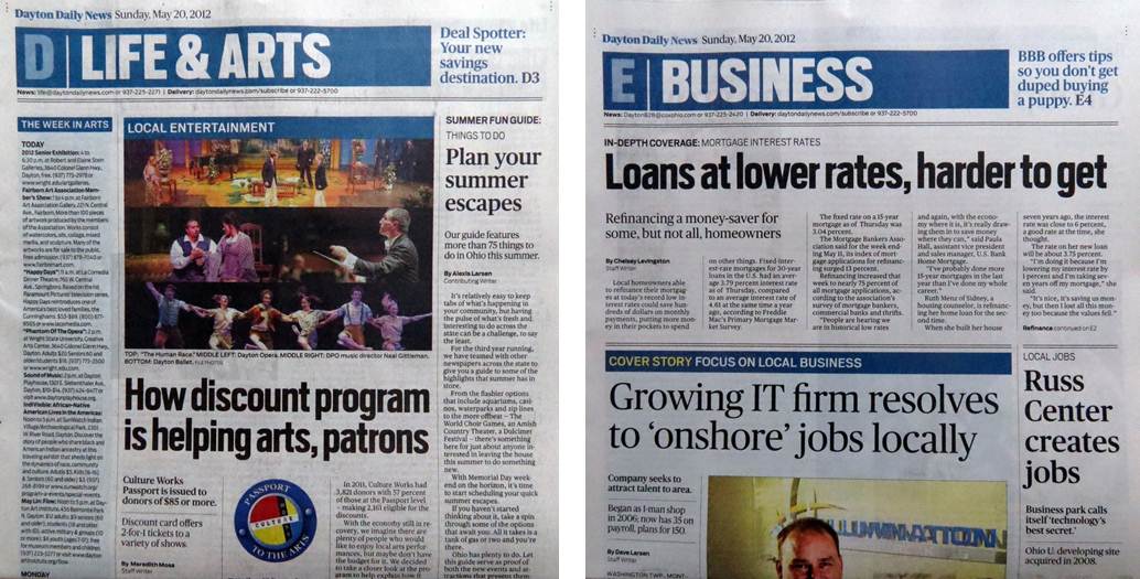
- the 'D' (life & whatever the day is) and 'E' (business) sections: both are like the 'B' section and do not use ALL CAPS BOLDED for banner headlines. The 'Life &' section varies throughout the week (printed as a tabloid on Mondays for the weekly TV listings and Fridays for a weekend entertainment guide but broadsheet the rest of the week) and 'Business' only gets this special treatment on Sundays (it is relegated to near the back of the 'A' section the other six days). Seeing two equal sized headlines with different fonts is very distracting in the above right example and sends mixed messages as to the staff really adhering to a common theme/template for this publication as a whole.
Before anyone fires up their keyboard to correct my terminology, I am not a graphic designer or someone who does desktop publishing for a living so I apologize in advance if I may have misnamed any of the components of a newspaper. Who I am, however, is a person with the ability to detect subtle differences in overall visual and graphic compositions, to include typeface, spacing, balance, format and overall aesthetic appeal. As someone who is familiar with online browsing via computers, e-book readers and other devices, I understand the effects that an improper or illegible font has on the overall reading experience. While that setting can easily be changed on a screen, font or typeface exchanging not a feature that is available to a reader once the material is physically printed. This change will not be a 'deal breaker' for us but it will detract from my daily experience with the paper and serve as a constant reminder of just how "squishy" Cox Media management has become over recent years (and don't get me started on their op/ed pages).
The Dayton Daily News, while not a perfect product, had its own unique elegance and distinctive look when compared to Ohio's other major newspapers. After these recent changes, it now competes in aesthetic "quirkiness" with the Cincinnati Enquirer by exhibiting the same "subtle changes" that its Cox Media Group sister publications (the Atlanta Journal-Constitution and the Austin American-Statesman) foisted upon similarly 'gifted' readers in Georgia and Texas. Luckily, Cleveland's Plain Dealer, the Columbus Dispatch and the Toledo Blade remain "less legible" and "harder on the eyes", proving that they are less susceptible to the subjective whims and polling of their readers and remain true to their unique graphic styles and heritages--supposed "warts" and all.


No comments:
Post a Comment